
your business is quiet because of your logo
Everyone has sat in front of their computer and tried to create a DIY logo. Whether it's Canva or some other website let's be real we have all done it.
Killing your brand, that's what you're doing.
When you are brand new, you are just trying to get something up. A name. A color. A quick logo. Something that makes you feel official enough to start posting and telling people you exist. You tell yourself this is temporary. You tell yourself you will come back to it when you have more money, more clarity, more time. And what do we do? Never come back to it. We keep riding out that same outdated logo that probably 13 other businesses have, just with a different name.
That temporary logo becomes the face of your business for years. It ends up on your website, your packaging, your social media, your invoices, your email signature. It ends up being the first thing people ever see when they discover you. And before you know it, you have built an entire brand on something that was never meant to last.
A logo is not supposed to sit there and look cute.
It is supposed to help you make money.
Before someone reads your caption. Before they read your bio. Before they read your website.
They see your logo
And in those few seconds, they are already deciding how seriously to take you.
So how do we avoid this? The answer is simple.
Let’s break it down ↓
Build your logo around who you are trying to attract, not what you personally like.
One of the biggest mistakes people make is designing a logo based on their own taste. While you want your logo to have a little bit of your personality, remember this isn't resonating to the people you are trying to sell to. A logo that makes money is built for your audience, not for your friends. So instead of choosing your favorite color, favorite font, or favorite style.

Look at it this way
→ What color speaks (my brands personality)
→ What font speaks (my brands personality)
→ What style speaks (my brands personality)
Luxury fonts attract luxury clients
Rustic fonts attract vintage clients
Old school fonts attract older age groups
This is why sometimes you find brands changing their logos or re-branding their entire business. It's because their logo no longer speaks to their audience.
Old school fonts attract older age groups
This is why sometimes you find brands changing their logos or re-branding their entire business. It's because their logo no longer speaks to their audience.
Your logo should instantly communicate your industry or your vibe without needing explanation.
Your logo should instantly communicate your industry or your vibe without you having to explain a single thing. The moment someone sees it, they should already feel what kind of world your brand lives in. Whether it is through a symbol that clearly places you in a category or through typography, color, and style that carries a certain mood, the message should be obvious in seconds. People are not studying your logo, they are scanning, feeling, and deciding if this is for them. If your coffee shop logo looks like a law firm or your kids brand feels cold and corporate, you have already confused the person before they ever read your name. A strong logo does the talking for you before you ever get the chance to introduce yourself.
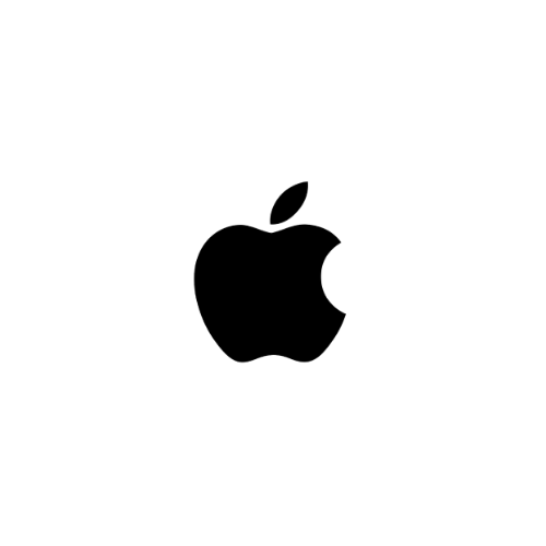
Lets use Apple’s logo as an example.
Pretend for a second nobody in the universe knew what the brand Apple was and they stumbled upon their logo. They'd feel these things
→ It's definitely not a grocery store because an apple is too basic
→ They probably sell high end products
→ They'd assume their products are sleek and timeless
No explanation. No backstory. No paragraph needed. The logo alone communicates the vibe of the brand before you ever know what they sell.
Your logo needs to work EVERYWHERE
Your logo isn't only mean to be used on your Instagram profile picture, it needs to work everywhere. Tiny profile pictures, storefront signs, packaging, embroidery, stickers, websites, invoices, social media posts, and everything in between. If your logo falls apart when it gets small, loses detail when it prints, or becomes unreadable on different backgrounds, it is not built for the real world your brand lives in.
A strong logo is flexible without using it's identity. It should still feel like your brand whether it is in black and white, shrunk down to an icon, blown up on a banner, or stamped onto a box. The shapes, spacing, and simplicity should allow it to translate across materials and sizes without needing to be redesigned every time. When a logo is truly functional, you do not have to babysit it or adjust it constantly to make it work.
Your logo packages should almost always come with these variations (bare minimum)
Primary Logo
This is the main logo that represents the brand as a whole. It is usually the most detailed version and the one used on websites, headers, and major brand placements where there is enough space for it to breathe.
Secondary Logo
A rearranged version of the primary logo that fits better in tighter or more horizontal or vertical spaces. It keeps the same elements but is structured differently so the brand still looks clean and balanced wherever it is placed.
Submark Logo
A simplified stamp style version of the logo, often contained in a shape like a circle or badge. This is perfect for packaging, stickers, social media highlights, and small branded areas where the full logo would feel too large.
Icon Mark
The most minimal form of the brand, usually just a symbol or initials pulled from the main logo. This is what works best for profile pictures, favicons, watermarks, and tiny placements where detail would get lost.
Wordmark or Lettermark A typography focused version using just the brand name or initials. This allows the brand to stand strong even when the symbol is not present and works beautifully for clean, modern applications.
When you have a full logo suite, your brand stops feeling limited and starts feeling polished and intentional. You are no longer struggling to “make the logo fit” because you already have a version designed for that exact use. And that kind of flexibility is what allows your logo to show up everywhere confidently, which is what turns a good design into a powerful, recognizable brand.
Avoid templates that make you look like ten other businesses.
Templates feel convenient and fast, but just as fast as you make them they also kill your brand. This is also why templates hurt more than people realize. Templates are designed to be reused, which means your brand ends up looking familiar in the worst way. And familiar does not stand out. If you do not stand out, you do not get remembered. And if you are not remembered, you are easily replaced.
What most people do not see is that templates remove the intention behind design. They are not built around your audience, your industry, or the feeling you want people to have when they see your brand. They are built to be edited quickly and sold over and over again. That means the shapes, spacing, fonts, and symbols were never chosen because they fit you. They were chosen because they fit anyone.
How do you know you’re using a logo template?
This one might hurt some feelings, but using a logo template doesn’t mean you “designed your logo”
If you opened Canva or another logo template app, typed your business name into a pre made layout, and just swapped things around, that is a template. If the layout already existed before your brand existed, that is a template.
If your logo could easily be replaced with another business name and still make sense, that is a template.
This is the biggest giveaway.
A real logo only works for one brand.
A template works for everyone.
Think long term so you do not feel the need to rebrand every year
Rebranding every year is not a flex. It is usually a sign that the first brand was built on vibes instead of foundation. And I get it. When you are new, you are excited. You are inspired. You are trying to make everything look like a real business as fast as possible. So you pick a font you like today. You pick colors that feel cute right now. You grab a logo that looks clean enough to post. You tell yourself it will do for now.
Then a few months go by and suddenly it feels off. Not because your business is failing, but because your business is growing. You are learning your audience. You are finding your voice. You are getting clearer about what you actually want to be known for. And your logo is still stuck in that early version of you that was just trying to get something up and running.
You start saying things like my branding does not feel like me anymore.
My logo feels childish.
My logo looks cheap.
My logo does not match my prices.
My logo looks like it’s made on Canva.
My logo does not look like where I am trying to go.
And then you do what most people do. You rebrand.
That constant rebrand cycle is exhausting and honestly it is expensive, even when you are doing it yourself. Because it is not just a logo. It is your website. Your packaging. Your highlights. Your templates. Your business cards. Your watermarks. Your email signature. Your invoices. Every single touchpoint has to change. And while you are busy rebuilding the look of your business, you are not focused on growing the business.
And here is the part that nobody wants to admit.
Every time you rebrand, you reset your recognition.
There is a girl in your class who changes her hair color every single week. One week it is red. Next week it is blue. Then blonde. Then black. Then pink. After a while, you stop taking her “new look” seriously because you expect it to change again. There is no consistency. No identity. No recognition. You never really know who she is because she is always trying on something new.
Now think about another girl who evolves her style year to year. Maybe one year she dresses more sporty. The next year she leans into neutral tones. The next year she refines it even more. She is still herself. You can still recognize her. But she is growing into her style instead of replacing it every week.
That is the difference between constantly rebranding and building a logo that lasts.
A good logo won't carry a lazy business.
And here is the part most people forget after all of this.
Yes, your logo is the face of your brand.
But there still has to be a real, hardworking business behind that face.
Because a logo can open the door, but it cannot carry a lazy brand. It cannot make up for inconsistency. It cannot make up for poor communication. It cannot make up for not showing up. You can have the most strategic, beautiful, intentional logo in the world, but if someone clicks onto your page and sees no effort, no clarity, no consistency, they will feel that disconnect instantly. The face looks polished, but the personality behind it feels empty.
A good logo can get people to buy your product but it's the trust and personality that makes people stay and continue to buy from you.That trust is built through how you show up. How often you post. How clearly you explain your services. How quickly you respond. How organized your process is. How much care you put into what you do. That is the personality of your brand. That is what gives your logo life.
Your logo is your face. Your work ethic is your character.
And when those two match, that is when your brand starts to feel real, established, and worth investing in.
Free logo workshop
I’ve created logos for 100+ brands and I ask myself the same questions every single time.
Your logos job is to look good and be strategic, let’s ensure that your logo meets all the requirements.
Download my mini logo workshop questionnaire to help you create a memorable logo.