
What makes a good logo?
Logo are one of those things that everyone recognizes, but not everyone understands. Every single graphic designer you meet will always use the same 5 words because these words are what make a GOOD functional logo.
Simplicity
A good logo won't try to explain everything at one. If it's too detailed, too busy, and too complicated, people wont remember it. Think of it, when is the last time you've remember a illustration or a detailed painting? The best logos are stripped down to the essentials. They're simple enough that you could draw them from memory. Think of McDonalds golden arches, it's literally two curves, yet its recognized by the entire world. That being said simplicity doesn't mean your logo has to be boring, it just has to make sense.
Memorable at glance
Recognition matters. A logo should leave an impression after a single glance. If someone sees it once and can’t recall it later, it’s not doing its job. The most memorable logos usually have one strong idea behind them, not three or four competing ones. That’s why FedEx’s hidden arrow works so well it’s a clever little detail that people remember once they notice it.
Versatility in the real world
A logo isn’t designed to live in a perfect design file. It’s going to be printed on tiny labels, blown up on billboards, stitched onto shirts, and used as profile pictures on social media. A good logo works in black and white, in color, and in every size. If it falls apart the second it’s shrunk to an Instagram icon, it’s not versatile enough.
Timeless beats trendy
Trends come and go. What feels “cool” in 2025 might feel painfully outdated in five years. That’s why timelessness matters. A good logo leans on solid shapes, proportions, and ideas that won’t age overnight. Coca-Cola’s logo has survived for more than a century because it’s built on strong typography, not passing design tricks.
Appropriate to the brand
Lastly, a good logo feels like it belongs to the brand it represents. It doesn’t have to show exactly what the company does, but it should feel right. A playful children’s toy company can get away with bright colors and rounded type. A luxury fashion house needs elegance, restraint, and polish. A logo should reflect the personality and values of the brand in a way that clicks with its audience.
Let's take a look at some examples
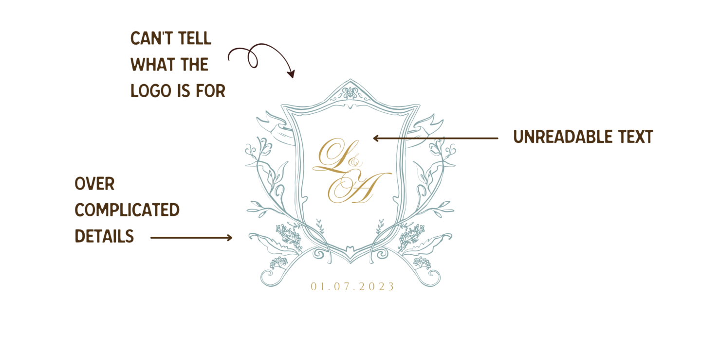
A BAD logo
A bad logo is usually trying too hard. It’s trying to cram meaning, uniqueness, and trendiness all into one mark, and it forgets the basics: simple, memorable, versatile, timeless, appropriate. If it fails those tests, no amount of “but it’s creative!” saves it.
Make it stand out
Whatever it is, the way you tell your story online can make all the difference.
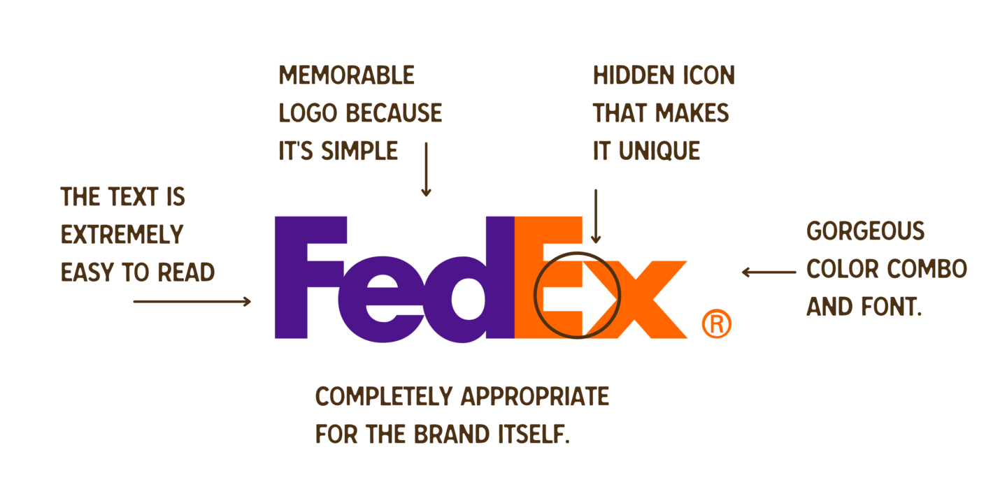
A GOOD logo
Your object with a good logo is to have readable text, make sure you're targeting the correct audience, and keeping the logo simple enough to where you can size it small and large. Remember: simple, memorable, versatile, timeless, appropriate. If your logo checks all these things then it's a GOOD logo.
Can I turn a bad logo into a good logo?
Absolutely yes. Sometimes we design a logo thinking its the best logo ever, but yes we can also be blind to our own work. Part of being a designer is also taking criticism so make sure you're listening to your clients (if what they're saying is do-able)
Just as much as we design or job is also to problem solve and fixing a bad logo is one of those things.
If I design a bad logo or come across re-designing a bad logo I like to do the following things
Strip the logo down into different parts. Say you're trying to save your favorite sweater, you want to cut off the loose threads and parts that are making the sweater fall apart. The same thing goes for a logo. See what parts are good, soo you can save them for the redesign.
Play around with different text styles. A font can make or break your logo. Take a look at the font and play around with it to find something that fits your logo perfectly.
Rearrange some of the logo items. Maybe its a good logo, but the placement makes it look off. Rearranging a logo can SAVE your logo.
Colors make a difference. If your logo is looking dull chances are the color is a bit off. Remember colors tell a story, play around with them to create something beautiful.
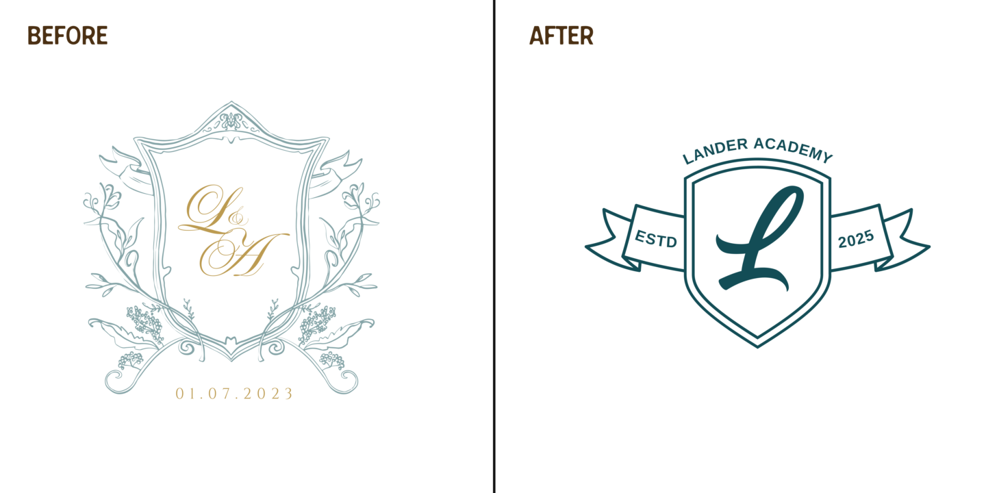
Remember that ugly logo from earlier? Using all these methods above I completely redesigned it. You can do this too. You can see I kept the same concept but changed the elements to make them more simple and readable.
Illustrative logos that work
Now just because a logo it complicated doesn't mean that it's horrible. There are some cases where you'll find a illustrative logo that completly hits the mark, but these logos also have secondary logos that are a little bit more simplified in the case that their client will need it.
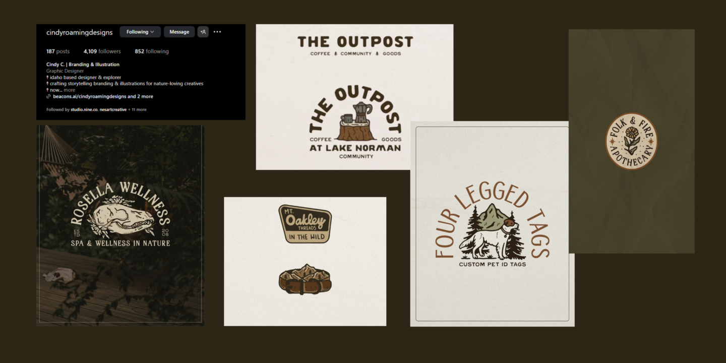
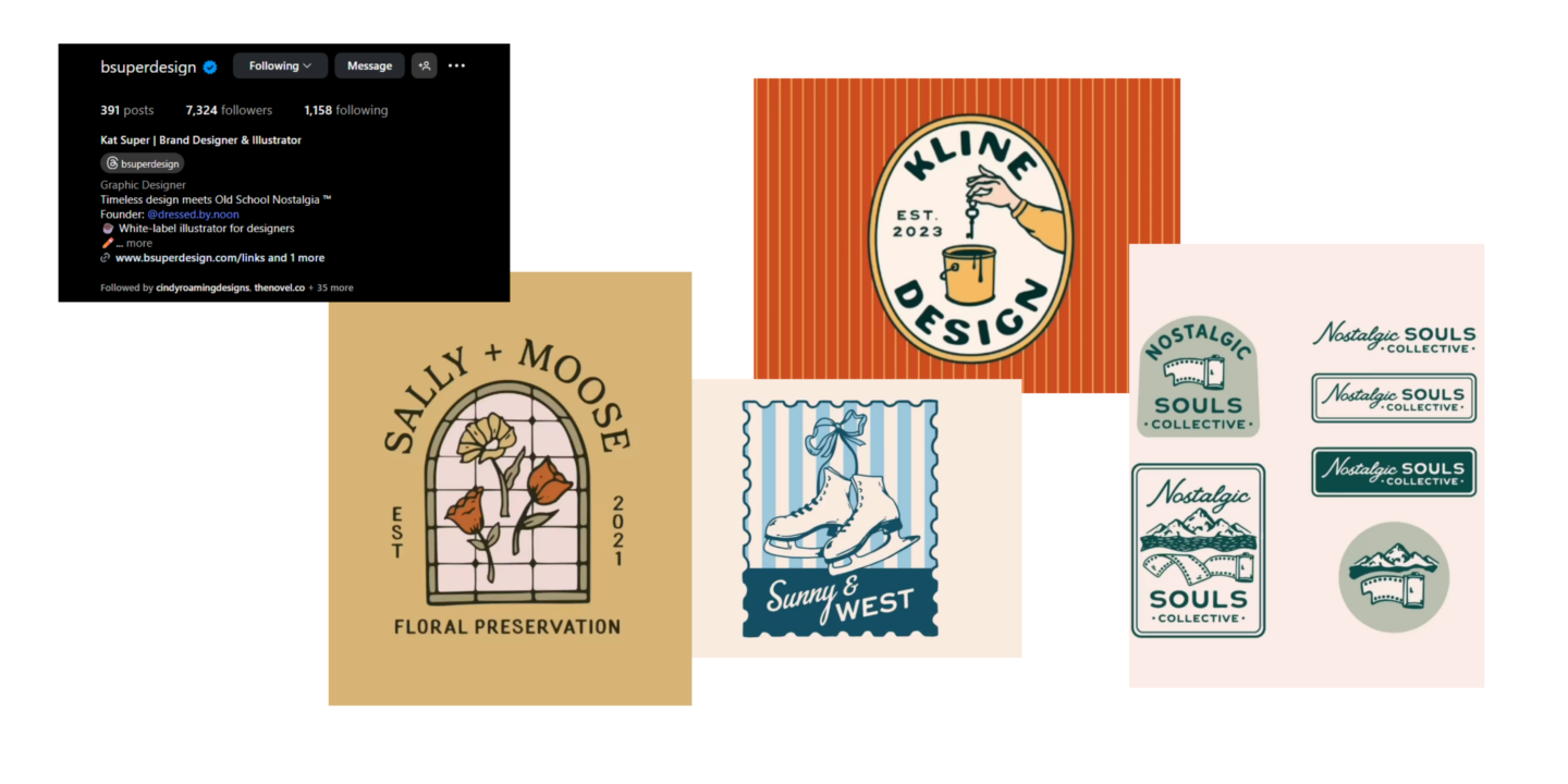
Here's an example of one of my favorite designers on Instagram right now who absolutely nails the illustrative style @cindyroamingdesigns
Illustrative logos tell a story right away. They’re packed with personality, emotion, and detail, which can make them instantly memorable. Think of a brewery logo with a hand-drawn hop, or a coffee shop with a cozy illustrated cabin in the woods. The illustration creates a vibe that a plain wordmark just can’t.
They also build character. For brands that lean on culture, heritage, or craft, illustration becomes a visual shorthand for “authentic.” A hand-drawn crest feels artisanal. A playful mascot sketch feels fun and approachable.
Here’s another designer that absolutely nails the illustrative style! @bsuperdesign
The Catch: Balance
Here’s the trick: illustration has to be functional as a logo, not just a piece of art. That means it still needs to pass the big tests:
Can it shrink down and still read clearly?
Can it work in one color, or does it rely on shading and detail?
Can the essence of the illustration be simplified into a secondary mark (like a badge, monogram, or icon)?
If an illustrative logo only works blown up on a poster but fails on a business card or app icon, then it’s not doing its job. BUT again if you pair it with a secondary font that will work on different platforms, you're good to go!
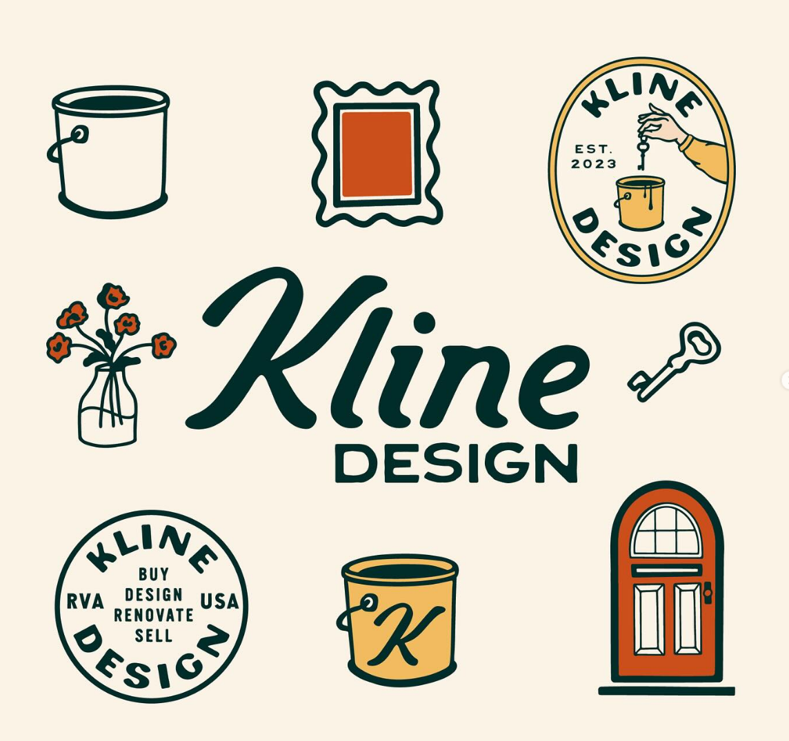
Here's a prime example of having more variations when your style is illustrative. You want to have 1-2 extra logo styles in your logo suite that your clients can use on their store front design, instagram icon, website, etc.
The best part about illustrative logos is most of the time people know exactly who designed in because of the style. This can help build recognition and create a solid platform for your work.
An illustrative logo, when done with clarity and restraint, can be just as instantly recognizable as the simplest wordmark.the uniqueness of the illustration creates a mental shortcut that sticks after only a glance. Because no two illustrations are exactly the same, the mark avoids blending in with competitors who might be using similar fonts or abstract symbols. Instead, the illustration becomes a visual signature, instantly tied to your brand in people’s minds, no matter where they encounter it, so if this is your style you can find a way to make it work perfectly.