How to Create a Cohesive Instagram Feed That Attracts Followers
About 90% of my clients come directly from Instagram, and one thing I hear time and time again before someone decides to work with me is that my Instagram feed is what initially attracted them to my page.
And honestly? That says a lot.
I think one of the most overlooked aspects of promoting your business on social media is your actual Instagram feed. We spend so much time worrying about what to post, how often to post, and whether the algorithm is working in our favor that we sometimes forget about the first thing people see when they land on our profiles.
Your Instagram feed is your first impression.
Whether you're promoting a business, sharing your creativity, selling a product, or simply trying to grow your audience, the way you visually present yourself matters more than you might think.
There's no denying that we live in an era where social media plays a huge role in how people discover and connect with businesses. For many of us, our Instagram profiles are the very first interaction someone has with our brand, long before they visit our website, inquire about our services, or purchase a product.
And here's something I always want business owners and creatives to understand:
Your colors tell your brand's story before you ever get the chance to.
Before someone reads your bio, scrolls through your captions, or learns what your business is about, they're already forming an impression based on what they see. Your color choices can communicate a certain mood, personality, and feeling without you having to say a single word.
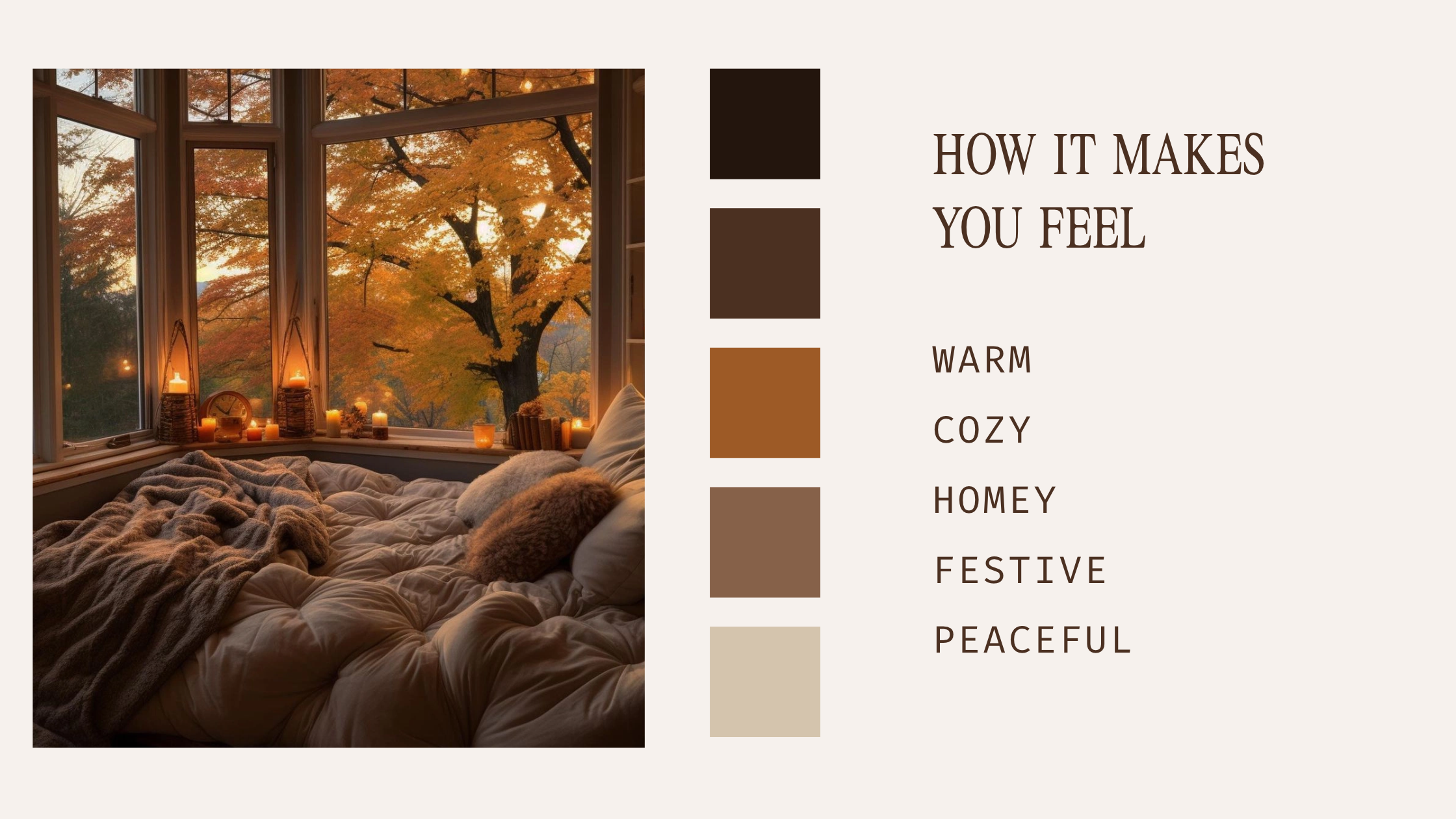
Think About Autumn for a Second...
We're currently in the autumn season, and if you're anything like me, you absolutely love this time of year.
But have you ever stopped to think about why so many people love autumn?
Of course, there's the cooler weather, the cozy sweaters, and the excuse to have another cup of coffee (as if we needed one). But a huge part of what makes autumn so special is the colors.
Think about all those beautiful shades of burnt orange, warm brown, deep red, and golden yellow. They're rich, earthy, and comforting. They create this feeling of warmth and familiarity that so many of us associate with being cozy and at home.
There's something about walking outside, seeing the leaves changing colors, and being surrounded by those warm tones that just makes everything feel a little more peaceful. Almost like the world outside has turned into an extension of your home.
And one of the biggest reasons you experience that feeling is because of the warm colors that autumn brings.
Those beautiful oranges, browns, and golden tones contribute to the sense of comfort and coziness we associate with the season. Of course, our memories and personal experiences play a role too, but color is a huge part of creating that atmosphere.
And that's exactly what I mean when I say colors have the ability to create feelings before words ever do.
Now, think about how you can apply that same concept to your Instagram feed and your brand.
Just like autumn has a recognizable color palette that creates a certain atmosphere, your brand can use colors intentionally to create an experience that people begin to recognize, remember, and connect with.
Okay, Enough About Why Colors Matter. Let's Talk About What You Can Actually Do.
Now that we've talked about the importance of color and how it can influence the way people perceive your brand, I want to share some practical things you can start implementing on your Instagram today.
Because knowing why something works is great, but knowing how to actually use it is even better.
1. Start Posting in 1080 × 1350 Pixels
The first thing I want you to start doing is creating your Instagram posts in 1080 × 1350 pixels, which is Instagram's traditional portrait format with a 4:5 aspect ratio.
And there's a reason I'm recommending this.
When someone is scrolling through their Instagram feed, a portrait post takes up more vertical screen space than a traditional square post. That gives your content a larger visual presence and more room to grab someone's attention.
Think about it. When you're scrolling through Instagram, you're constantly being shown different photos, videos, and graphics. Everything is competing for your attention.
By using a taller format, you're giving your content a better opportunity to stand out, catch someone's eye, and encourage them to stop scrolling long enough to actually look at what you've created.
Now, does this mean that simply changing your post dimensions will magically increase your engagement? Of course not.
But it's a small, intentional design decision that can make a difference in how your content is presented.
And sometimes, those little details are exactly what your Instagram feed needs.
2. Choose 4–5 Colors That Represent Your Brand's Personality
The next thing I want you to do is choose four to five colors that represent the overall mood, personality, and feeling of your brand.
One of the biggest mistakes I see people making, especially when they're trying to get more views or attract new followers, is using way too many colors throughout their Instagram feed.
And listen, I love color just as much as the next designer. But there's a difference between using colors intentionally and throwing a bunch of random colors together because you think they'll grab someone's attention.
When every post has a completely different color scheme, your brand can start to feel a little all over the place. There's no consistent visual identity, no recognizable mood, and nothing that really connects one post to the next.
Your Instagram feed should feel like one brand telling one story, not ten different brands competing for attention.
Let me give you an example.
Imagine you're baking a cake. You start adding chocolate, vanilla, strawberries, lemon, cinnamon, and every other ingredient you can find in your kitchen. Individually, those ingredients might taste amazing, but when you throw everything together without a plan, the final result might taste a little... questionable.
Now imagine baking a simple vanilla cake or a rich chocolate cake.
You know exactly what you're getting. The flavors complement each other, everything feels intentional, and the final result makes sense.
That's exactly how I want you to think about your brand colors.
When you narrow your palette down to four or five complementary colors, you're creating something people can begin to recognize and associate with your business.
And no, this doesn't mean every single Instagram post needs to look identical or that you're never allowed to experiment with other colors.
It simply means having a consistent foundation that ties your content together.
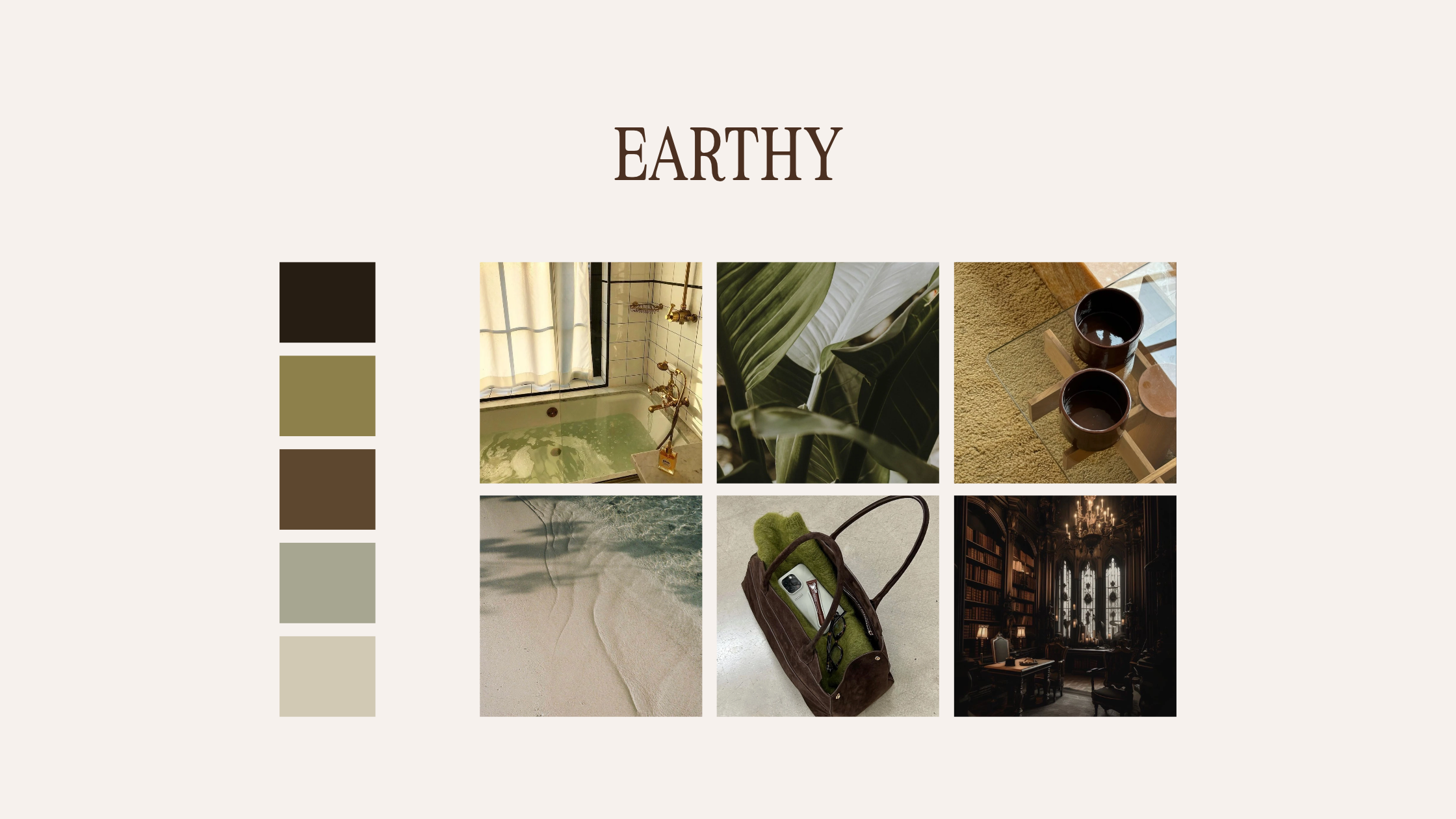
How to Actually Use Your Color Palette
Now, choosing your colors really depends on the type of message you want your brand to communicate.
Do you want your brand to feel warm and welcoming? Elegant and sophisticated? Playful and energetic? Calm and minimal?
These are all things you should be thinking about when choosing your colors.
You do not need to use all five colors in every single Instagram post.
In fact, I wouldn't recommend doing that.
Instead, what I want you to do is take at least one color from your chosen palette and intentionally incorporate it into each post.
For example, let's say you're creating a graphic for Instagram. You might use cream as your background color and brown for your typography.
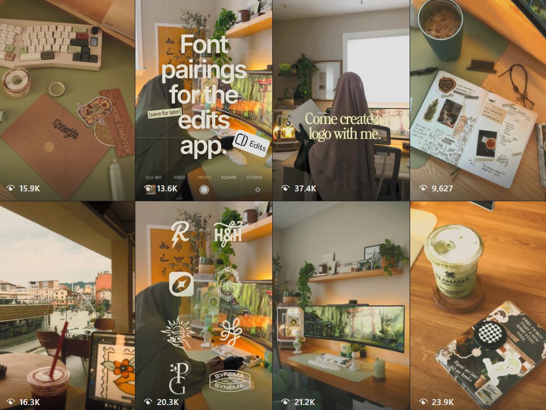
For your next post, maybe you're sharing a photograph of your workspace. You could incorporate an olive green notebook, a brown coffee mug, or a beige background.
Then, for another post, you might use terracotta as an accent color in your design.
See what we're doing here?
Every post is different, but there's still something visually connecting them.
That's what creates a cohesive Instagram feed.
You're not forcing every post to look exactly the same. You're simply creating a consistent visual language that carries throughout your content.
And when someone visits your Instagram profile and looks at your posts together, everything begins to feel more intentional, organized, and connected.
Rather than seeing a collection of random graphics and photographs, they're seeing a brand with a recognizable personality.
The goal isn't to make your Instagram feed look perfect. The goal is to make it feel like everything belongs together.
Because the more consistent your visual identity becomes, the easier it is for people to recognize your content and associate it with your business.
And that recognition is what we're trying to build.
3. Create a Recognizable Style With Your Content
Now, here's something I really want you to understand: having a cohesive Instagram feed goes beyond just choosing the right colors.
Your content itself should also have a sense of consistency.
And when I say consistency, I'm not talking about posting every single day or making the exact same video over and over again.
I'm talking about developing a recognizable style that people begin to associate with you and your brand.
Think about some of your favorite content creators. Have you ever been scrolling through Instagram, come across a video, and immediately known who posted it before you even looked at their username?
That's exactly what we're trying to achieve.
You want people to recognize your content before they even see your name.
So, how do you actually do that?
It can be something as simple as the way you take your photographs, the angles you use when recording your videos, or even the way you edit your content.
For example, maybe you always take your photographs from a slightly overhead angle. Maybe your videos have a warm, cozy color grade, or perhaps you prefer darker tones that create a more sophisticated and moody atmosphere.
Whatever it may be, those little creative decisions eventually become part of your visual identity.
And the best part? It doesn't have to be anything complicated.
You could even create consistency through the way you introduce your videos.
Maybe you have a specific phrase or hook that you use when you start speaking. Maybe you always open your videos with a particular camera angle, transition, or recognizable editing style.
Over time, those small details can become something your audience naturally associates with you.
It's almost like creating your own signature.
Think about it this way: when you see a familiar logo, you don't necessarily need to read the business name to know which company it belongs to.
Your content should work toward creating that same level of recognition.
Now, does this mean you should never experiment with new photography styles, editing techniques, or video formats? Absolutely not.
As creatives, experimenting is how we grow and improve our work.
But having a consistent foundation gives your audience something familiar to connect with, even as your content continues to evolve.
The goal is to make your content feel like it belongs to you.
Because when people begin recognizing your photographs, videos, colors, and overall creative style, you're doing more than just making your Instagram look aesthetically pleasing.
You're building a brand identity that people can recognize, remember, and eventually trust.
Quality Matters Just as Much as Consistency
Now, while we're on the topic of creating recognizable content, there's another thing I want to talk about: the quality of your photos and videos.
You can have the most beautiful color palette and a perfectly cohesive Instagram feed, but if your photos are blurry, your videos are poorly lit, or your content looks rushed, it can take away from the overall experience you're trying to create.
And no, this doesn't mean you need to go out and purchase a $3,000 camera. Trust me, your phone is more than capable of creating beautiful content when you know how to use it.
For those of you who mainly post videos, here's a little advice.
Try recording your videos in 4K at 30 FPS or 60 FPS, depending on the type of content you're creating.
Recording in 4K gives you more detail to work with, especially if you plan on cropping your footage, zooming in, or making adjustments while editing.
However, Instagram generally delivers videos at a lower resolution than 4K and applies compression during the upload process. This means uploading a 4K file doesn't necessarily mean your audience will see it in 4K.
Personally, I recommend recording in 4K when possible and exporting your finished Instagram Reels at 1080 × 1920 pixels (9:16). This gives you a good balance between quality and a format designed for Instagram.
And here's another little tip: make sure you have Instagram's highest-quality upload setting enabled, if it's available in your app.
But technical settings are only one part of the equation.
Your environment matters just as much as your camera settings.
Before you start recording or taking photographs, take a look at what's happening in the background.
Is your space clean? Is the lighting good? Are there random objects distracting from what you're trying to show?
You don't need a perfectly decorated studio or an expensive setup. Sometimes all it takes is clearing your desk, moving closer to a window for natural lighting, or adjusting your camera angle.
You can also create a more intentional look through your editing.
Maybe you prefer adding a warm filter to your photographs, using a darker color grade, or keeping everything bright and minimal.
Whatever style you choose, try to keep it consistent with the overall mood of your brand.
And here's how I want you to think about all of this.
Showing up online is a lot like showing up for a job interview or going out with your friends.
When you're getting ready to go somewhere, you usually want to look and feel your best, right?
You pick out a nice outfit, make sure you smell good, brush your teeth, wash your face, and put a little effort into how you're presenting yourself.
Not because you need to be perfect, but because you care about the impression you're making.
Well, the same concept applies to your content.
Your Instagram is often the first place someone meets you or your business. And just like you would put effort into presenting yourself in person, you should put that same care into how you present your brand online.
You don't have to create perfect content. You just have to create content that looks intentional.
Because when people can see that you care about the little details, it helps communicate the level of care and professionalism you bring to your business.
And that can make a difference in whether someone decides to stick around, follow your account, or eventually become a customer.
4. Figure Out What You Want Your Instagram Feed to Say About Your Brand
So, now that we've talked about color palettes, content styles, and creating a cohesive Instagram feed, you might be wondering:
How do I actually figure out what message I want my Instagram feed to give off?
Well, here's something I personally like to do, and it's an exercise I recommend trying for yourself.
First, sit down and really think about the colors that you naturally gravitate toward.
What colors do you actually like? What colors make you feel inspired? Are you someone who loves warm, earthy tones? Maybe you're drawn to soft pastels, bold colors, or something a little more dark and sophisticated.
Now, I want to make something clear.
Your brand colors don't necessarily have to be your favorite colors.
At the end of the day, your brand should communicate a message that makes sense for your business and the audience you're trying to attract.
But I also think it's important to genuinely appreciate the content you're creating.
Because when you actually like what you're putting out into the world, it becomes easier to show up authentically, stay creative, and enjoy the process.
And trust me, creating content becomes a whole lot easier when you're not forcing yourself to follow an aesthetic you don't even like.
Here's a Little Exercise I Want You to Try
Grab a notebook, open your Notes app, or use whatever you prefer to organize your ideas.
Start by writing down some of your favorite colors.
And don't feel like you have to narrow everything down to four or five colors immediately.
You can experiment!
Maybe you create three different palettes with four colors each. Or maybe you put together five different palettes with five colors each.
The point is to give yourself options and explore different combinations before committing to one.
Once you've created a few palettes, I want you to take a closer look at each one.
Ask yourself what those colors communicate.
For example, an earthy palette with browns, creams, and greens might communicate warmth, comfort, and a connection to nature.
A palette with black, white, and deep burgundy might communicate elegance, sophistication, and confidence.
And a palette filled with brighter colors might communicate creativity, energy, and playfulness.
Of course, colors don't have one universal meaning. The way people interpret them can depend on culture, personal experiences, and the way they're used together.
But this exercise will help you start thinking about your colors more intentionally.
Now, I want you to do one more thing.
Write down what you actually want your brand to represent.
Do you want people to feel comfortable when they visit your page? Do you want your business to feel luxurious and professional? Maybe you want your brand to feel approachable, creative, or full of personality.
Whatever it may be, write it down.
Then, start comparing those words with the different color palettes you've created.
Which palette feels the most aligned with the message you're trying to communicate?
Which one feels authentic to you while still making sense for your business?
And most importantly, which one can you realistically see yourself using consistently?
That's where you begin building your brand's visual identity.
The Hardest Part Is Actually Choosing Your Colors
Now, I'm going to tell you something that might surprise you.
In my opinion, building your color palette is actually harder than taking the pictures themselves.
And I say this because choosing your colors requires you to sit down and really think about the direction you want your brand to go in.
You're making decisions about your brand's personality, how you want people to perceive your business, and the overall atmosphere you want to create.
But once you have that foundation in place?
Creating content becomes so much easier.
Instead of constantly wondering what colors to use, what backgrounds to photograph, or how to edit your pictures, you already have a direction.
You know what colors you're working with. You know what kind of mood you're trying to create. And you know how to make your content feel connected.
For example, if you've chosen an earthy color palette, you might naturally start looking for warm backgrounds, wooden textures, neutral accessories, or green accents when taking photographs.
Suddenly, you're not just taking random pictures and hoping they look good together.
You're creating content with a purpose.
And that's what I want you to take away from this entire process.
A cohesive Instagram feed isn't about making every single post look identical or following whatever aesthetic happens to be trending that week.
It's about understanding your brand, choosing a visual direction, and creating content that consistently reflects the message you want to share.